html
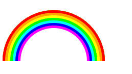
1 | <div class="caihong"></div> |
css
1 | .caihong { |
参考地址:clip-path属性详情https://developer.mozilla.org/zh-CN/docs/Web/CSS/clip-path#fill-rule
1 | <div class="caihong"></div> |
1 | .caihong { |
参考地址:clip-path属性详情https://developer.mozilla.org/zh-CN/docs/Web/CSS/clip-path#fill-rule
本文标题:CSS3手工彩虹
文章作者:mogugit
发布时间:2020-06-02, 15:46:33
最后更新:2025-03-24, 10:47:54
原始链接:https://mogugit.github.io/2020/06/02/CSS3%E6%89%8B%E5%B7%A5%E5%BD%A9%E8%99%B9/
许可协议: "署名-非商用-相同方式共享 4.0" 转载请保留原文链接及作者。